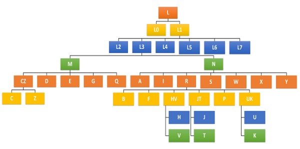
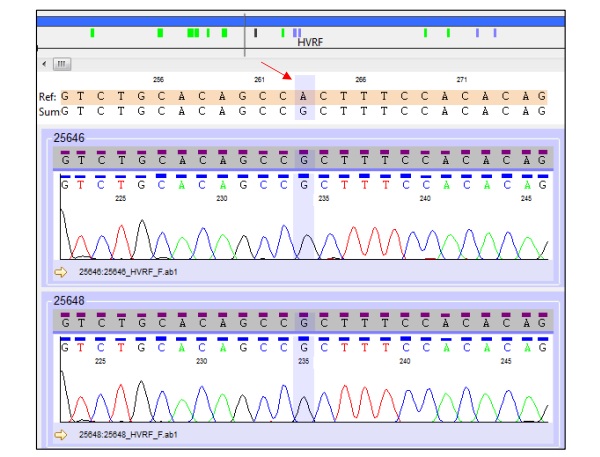
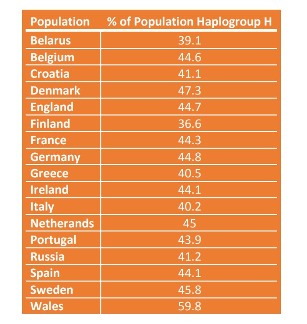
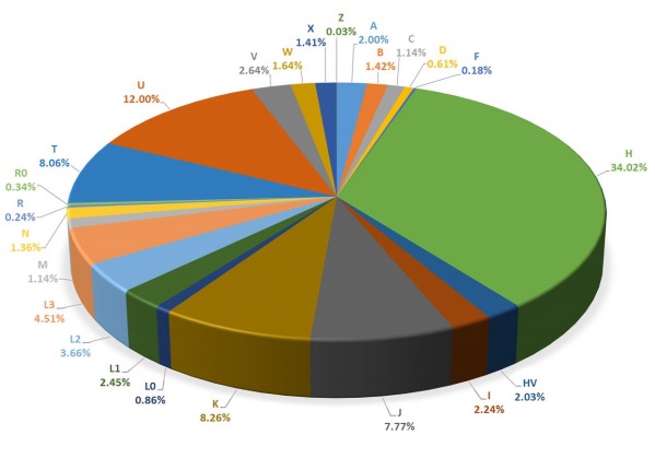
×


            Screenshot 1 of 5


                    Diagram showing the various haplogroup lineages.


            Screenshot 2 of 5


                    Some of my raw data.


            Screenshot 3 of 5


                    Table showing the frequency of haplogroup H in various European populations.


            Screenshot 4 of 5


                    Pie chart showing the relative frequencies of maternal haplogroups.


            Screenshot 5 of 5


                    Map showing the migratory routes associated with different haplogroups.