

-
Ancestry Kit
review on October 1, 2018
by Craig Macpherson

At a Glance
Screenshots
Summary
I found the Living DNA test to be absolutely marvelous. The results helped me confirm some of the things I already knew about my family, and uncovered a few mysteries that I was keen to pursue. The information was beautifully laid out, the explanations were clear and engaging, and the customer service was exemplary.
Overall, Living DNA is fantastic value for money and even though they’re still working on a few of the features, their test has the potential to be the best on the market (although please note that it does not offer a 'Family Finder' feature).
Full Review
In 2016, the founders of DNA Worldwide launched a new company, Living DNA, which focusses on genetic ancestry testing. DNA Worldwide have sold several types of genetic ancestry test in recent years: those they’ve developed themselves, those developed with Family Tree DNA, and those developed with Scotlands DNA. Few organizations have worked so hard to reinvent and improve their tests, so I had high hopes for Living DNA!
Product Expectations
The Living DNA site offers just one test, which keeps it nice and simple. Living DNA state that they believe theirs is the first truly global DNA test, attributing your ancestry to up to 80 worldwide regions. They’re also able to attribute your ancestry to up to 21 regions of the British Isles, meeting the needs of those who want more detail about their British heritage specifically.
The ability to attribute your ancestry to this many specific regions seemed absolutely amazing. Most of the tests on the market will only attribute your ancestry to broader, and sometimes overlapping regions; e.g. the British Isles, Ireland, Western Europe. It was also great to see that all 80 worldwide regions and all 21 British Isles regions had been listed on the site – very few genetic ancestry companies provide this information up front.
The site went on to say that the test would report on my ‘Family Ancestry’ (by analyzing my autosomal DNA), my ‘Motherline’ ancestry (by analyzing my mitochondrial DNA) and my ‘Fatherline’ ancestry (by analyzing my Y chromosome). Although there wasn’t a single pack of example results on the site, examples of the interactive maps and charts that I could expect were shown on various pages. The formats appeared pretty standard, and I was keen to see the level of interaction that would be possible.
I read that the results would contain charts and maps showing the ethnic groups who’ve contributed to my DNA, and the location of those who share my maternal and paternal lineage. I’d also be provided with maps that show the migratory paths of my ancestors after they left Africa hundreds of thousands of years ago, and I’d receive ‘Phylogenetic Trees’ that show how my lineage is connected to the lineage of all other humans.
In terms of privacy, there was a “Privacy & Security” page on the Living DNA website, containing six sub-pages titled “You’re in charge of your DNA”, “Considerations of testing”, “Consent to research”, “Privacy policy”, “Cookie policy” and “Terms & Conditions”. Here, I could choose to participate anonymously in the Living DNA Global Research Project. Details about how my raw data would be used and by whom could be found on the “Consent to research” page.
Ordering Experience
The ordering experience was seamless. There was an option to order a hard copy of the results for another £39 (which would have been perfect had I been buying the test for a parent or grandparent), but I decided to stick with the online results only. I was delighted to see that shipping was free!
Upon reading the Terms and Conditions I noticed that Living DNA stated they “shall not transfer your personal information outside the European Economic Area without your written consent”. This seemed a bit odd and I wondered which European countries my data might be going to and why...
The Terms and Conditions went on to say that I should read their ‘Privacy Statement’ to learn about what would happen to my biological sample once the test was complete. Although I was unable to find a Privacy Statement, I did find a ‘Privacy Policy’, and it told me that I’d have to inform Living DNA if I wanted my biological sample or digital information destroyed. The Privacy Policy also stated “If we were to sell our business, your information could be transferred to the purchaser as part of that sale” which was a little disturbing.
Although the Terms and Conditions (and the five other policies I found on the site) were simple to understand and well laid out, I have to say, I would have preferred that everything I needed to know had been contained in one document.
After completing the order, I received an order confirmation email and the testing kit arrived in the post a few days later. The kit was easy to use and it was a simple matter to set up my online account before returning the sample to the lab - I was grateful that a pre-addressed envelope had been included in the kit, postage paid! The site stated that I’d receive my results 10-12 weeks after returning my sample and sure enough, 12 weeks later I received an email to say that my results had been uploaded to my account.
The Results
The results were divided into four main sections: ‘Ancestry’, ‘Research’, ‘Share Results’ and ‘Test Details’. I went straight to the Ancestry section which had been broken into three sub-sections: ‘Family Ancestry’, ‘Motherline’ and ‘Fatherline’. The opening page of the Ancestry section explained which parts of my DNA had been used to produce each of the three sub-sections. There was also a summary showing that my Family Ancestry was 100% British Isles, that my Motherline was Haplogroup ‘I’, Subclade ‘I2a’, and that my Fatherline was Haplogroup ‘I-L22’, Subclade ‘I-CTS11603’.
Results Section: Family Ancestry
It was interesting that Living DNA were referring to their analysis of my autosomal DNA as my ‘Family Ancestry’, as none of the other reports I’ve purchased have used this term. Generally, an autosomal analysis produces your ‘ethnic mix’ or ‘ethnic breakdown’, so I was curious to understand why Living DNA are using different terminology. I read that the Family Ancestry section would provide a picture of the past ten generations of my family, and that it would reveal the geographic origin of my ancestors who’d contributed to my autosomal DNA.
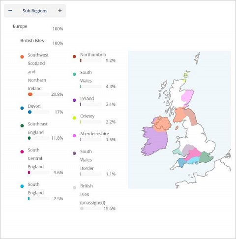
After going through the introduction, I scrolled down to my ‘Family Ancestry Map’, which showed the parts of the British Isles where my ancestors had contributed to my autosomal DNA: mainly Ireland, Southern Scotland, and Southern England. At first, I was frustrated that the map didn’t show the discrete regions that made up this shaded area. But upon contacting customer service, I learned that this feature was accessible in another section of the account. By clicking the ‘+’ button next to the word ‘Regional’ in this second section, I could see a ‘Sub Regional’ view where my ancestors were shown by discrete region (see below).

My Family Ancestry Map showing Sub Regions.
I was really impressed by the Sub Regional view and was amazed to see how many different British Isles regions my recent ancestors had originated from. I know that three generations ago my ancestors lived in London, the Republic of Ireland, Leeds, and Scotland, so it was gratifying to have my autosomal results confirm this. I was also glad to see that the largest proportion of my autosomal DNA (20.8%) is associated to Southern Scotland and Northern Ireland - I have a Scottish name so it’s nice to know I have a decent number of Scottish genes too!
Other autosomal tests I’ve taken, such as AncestryDNA, have revealed that a small proportion of my autosomal DNA (around 7%) can be attributed to Scandinavian ancestors. And I know from having my Y chromosome sequenced that a number of my paternal ancestors lived in Finland between 1550 to 1850. It was a shame that Living DNA’s analysis of my autosomal DNA didn’t corroborate this. However, they did say that their Family Ancestry Map would give me a picture of the past 4-5 generations of my family (I presume the reference to the past six generations in the Family Ancestry introduction was a typo), and as there’s roughly 20 years per generation, perhaps these results indicate that my Scandinavian ancestors came to the British Isles between 1850 and 1900?
Living DNA provided a couple of other ways to view the Sub Regional groups that had contributed to my autosomal DNA. In addition to the map, I could view these groups as proportions of a human-shaped image, or divided in a doughnut chart.
The Family Ancestry section also contained a ‘Through History’ sub-section, which was astounding! The Through History map let me see the spread of my ancestors at different points in history. The map came with a ‘Play’ feature that let me see the spread change as I went back through time, from 1,000 years ago (when my ancestors lived exclusively in the British Isles) to approximately 80,000 years ago (when everyone on the planet was my ancestor!). I could also choose to view the map at three different levels: ‘World’, ‘Europe’ or ‘British Isles’. Here’s the Through History map showing the spread of my ancestors at the European level in the Iron Age, approximately 2,800 years ago:

The Through History map showing the spread of my ancestors at the European level in the Iron Age, approximately 2,800 years ago.
It wasn’t made clear what the green dots represented and what the shading in the various regions meant, but I presume the green dots are the population groups with whom I share segments of my autosomal DNA, and that the darker the shading in a region, the more autosomal DNA I share with individuals in that region at that time.
It was also wonderful to see that for every stage in history (there were approximately 10 stages for each of the three levels), Living DNA had provided interesting notes and engaging pictures that allowed me to get a feel for the era and what life was like at that time. Here’s an excerpt of the notes that were provided for the Iron Age, approximately 2,800 years ago:

An excerpt of the notes that were provided for the Iron Age, approximately 2,800 years ago.
This Through History section was definitely the best feature of the Living DNA results as far as I’m concerned. Once I’d wrapped my head around it, I went back through history at all three levels, and even showed the maps to my dad, who loved them. Although there’s a short explanation of this section at the top, a tutorial or video explanation for these interactive maps would have been useful, as I found several aspects to be counterintuitive.
I found it odd that the maps only allowed you to go back in time, and not forward. What also appeared strange was that the spread of my ancestors became greater the further back I went, even though the human population became sparser. The result was that the map finally ended up fully shaded, as if the whole world had been fully populated some 80,000 years ago. But I doubt this is what Living DNA had in mind!
Results Section: Motherline
The Motherline section reported on my maternal heritage according to my mitochondrial DNA, and Living DNA said that it would cover as much as 200,000 years of my maternal lineage. The first Motherline sub-section was ‘History’ and it contained information about my maternal haplogroup ‘I’, subclade ‘I2a’.
I read that I likely share my maternal ancestry with those who first colonized Europe, and that this ancestral line arose 19,000 to 26,000 years ago. I was fascinated to learn that my Motherline is believed to have ‘back-migrated’ to Africa, as evidenced by the presence of my maternal haplogroup in Kenya! Living DNA went on to speculate about the lives that my ancient maternal ancestors lived, before touching on the science behind their analysis.
The next sub-section was the ‘Coverage Map’ which showed how prevalent my maternal haplogroup is around the world today. I was astonished to see that the two largest population groups with whom I share my maternal lineage are individuals in El Molo in Kenya (23%) and individuals in Rendilles in Kenya (18%)! The report went on to say that I share my maternal lineage with only 4% of individuals in the UK which seems absolutely crazy! I would love to have known more about this aspect of my ancestry, especially since Living DNA’s autosomal analysis indicated that the last 4-5 generations of my family are Scottish, Irish, and English!
The next sub-section was the ‘Migration Map’ which showed the migratory path of my maternal ancestors after they left Africa hundreds of thousands of years ago (shown below).

My Motherline Migration map.
As you can see, the Migration Map seems to indicate that that my recent maternal ancestors were Russian, which seems to conflict with my autosomal results and the Motherline Coverage Map discussed above. I’m sure there’s a reasonable explanation for these conflicts, but the disparate results began to seem a bit unsettling. I also felt it was a bit of a shame that you couldn’t interact with this map to see more information about the ‘N1’, ‘N’ or ‘L3’ haplogroups – it would have been interesting to see when these became distinct groups, and if they still existed.
The last sub-section showed the ‘Phylogenetic Tree’ for my Motherline which depicted my maternal haplogroup and subclade, and how they’re connected to all the other maternal haplogroups going back to the very first humans. Although I liked that this Tree had been included in the report, I didn’t find it particularly meaningful. Had I wanted to research my maternal ancestry further and wished to seek out others in my maternal haplogroup and subclade, I suspect I’d have found this sub-section more useful.
Results Section: Fatherline
The Fatherline section reported on my paternal heritage according to my Y chromosome, and Living DNA said that it would cover as much as 180,000 years of my paternal lineage. The first Fatherline sub-section contained information about my paternal haplogroup ‘I-L22’, subclade ‘I-CTS11603’. The ‘History’ sub-section informed me that my paternal haplogroup is most common in Scandinavia, and I was pleased to note that it corroborated the Scandinavian heritage that’d been reported on by other companies. I was also interested to read that my paternal haplogroup is almost entirely absent south of the Baltic Sea and North Sea, and that it’s rare in Britain and Ireland! My ancestry seemed to be getting stranger all the time and I must admit that I enjoyed learning about how unusual my family is.
Just like for the Motherline section, there was a Coverage Map which that showed where those who shared my paternal lineage were most prevalent. I learned that only 4% of individuals in England share my paternal lineage, compared to 25% of Norwegians, 20% of Danes, 20% of Swedes and 17% of Finns! The Migration Map supported this by showing how my paternal ancestors had left Africa and passed through Saudi Arabia, before eventually settling in Turkey, the Balkans, Central and Western Europe, and Scandinavia. The last sub-section of the Fatherline section was the ‘Phylogenetic Tree’ (excerpt shown below).

Part of my Fatherline Phylogenetic Tree showing my paternal haplogroup and subclade.
Just like for the Phylogenetic Tree in the Motherline section, I was glad that Living DNA had produced this for me, but I wasn’t sure how I would use it. One thing worth mentioning is that several genetic ancestry companies produce these trees, but Living DNA’s is the best I’ve seen; my paternal haplogroup and subclade are clearly shown on the tree, the interactive features are easy to use, and it’s simple to navigate.
Results Section: Research
Clicking on the “Research” tab, I was given the option to opt in to share my results with Living DNA Global Research. Details about how this research would be used to improve how genetic ancestry is mapped were included here, as well as on the “Research consent” page in the “Privacy & Security” section. It was reassuring both that I was not automatically included in this study, and that the agreement stated that if I were to participate then my genetic data would not be linked to my name, and I could opt out at any time.
Summary
I found the Living DNA test to be absolutely marvelous. The results helped me confirm some of the things I already knew about my family, and uncovered a few mysteries that I was keen to pursue. The information was beautifully laid out, the explanations were clear and engaging, and the customer service was exemplary.
Overall, Living DNA is fantastic value for money and even though they’re still working on a few of the features, their test has the potential to be the best on the market (although please note that it does not offer a 'Family Finder' feature).
Index
- Summary
- Full Review
- Product Expectations
- Ordering Experience
- The Results
- Results Section: Family Ancestry
- Results Section: Motherline
- Results Section: Fatherline
- Results Section: Research
- Summary
Living DNA Review
July 9, 2019
Combined Paternal & Maternal Analysis
They’ve been tremendous help.
Living DNA review by a DNA Testing Choice user2019-07-09
Living DNA Review
June 30, 2019
Combined Paternal & Maternal Analysis
They’ve been an amazing help. I am so pleased with the service they have given.
Living DNA review by a DNA Testing Choice user2019-06-30
Living DNA Review
June 25, 2019
Combined Paternal & Maternal Analysis
I’d like to express my genuine appreciation for the kindness and personal attention that LivingDNA has given to all of my correspondence.
Living DNA review by a DNA Testing Choice user2019-06-25
brilliant
June 14, 2019
Combined Paternal & Maternal Analysis
Thank you so much, we’ve waited years to get the answer to my ancestry and finally we had it from you. Would recommend you as excellent.
Living DNA review by a DNA Testing Choice user2019-06-14
Living DNA Review
June 13, 2019
Combined Paternal & Maternal Analysis
The customer service we have received from living over the last couple of days has been exceptional. We appreciate the effort they have gone to and the speed of their responses.
Living DNA review by a DNA Testing Choice user2019-06-13
Living DNA Review
June 3, 2019
Combined Paternal & Maternal Analysis
Thanks to Living DNA’s service I understand what is happening with my test results. I also recommend the Living DNA Facebook User Groups
Living DNA review by a DNA Testing Choice user2019-06-03
Living DNA Review
May 19, 2019
Combined Paternal & Maternal Analysis
Thank you Living DNA for all your help. They were fabulous, kind and patient with me.
Living DNA review by a DNA Testing Choice user2019-05-19
Living DNA Review
May 15, 2019
Combined Paternal & Maternal Analysis
I have been very impressed with LivingDNA so far and look forward to receiving their new book.
Living DNA review by a DNA Testing Choice user2019-05-15
Living DNA Review
May 9, 2019
Combined Paternal & Maternal Analysis
A master class in perfect customer service.
Living DNA review by a DNA Testing Choice user2019-05-09
Living DNA Review
May 3, 2019
Combined Paternal & Maternal Analysis
I must take this opportunity to tell you how impressed I am with the Living DNA service, not only for the extremely quick turnaround of the test and results, but also the parts of my ethnic mix which I can corroborate with my ‘paper’ research match the percentages expected and the known locations of those antecedents. This gives me confidence that the rest of the results are likely to be accurate as well.
I wish Living DNA every success and I do not hesitate to recommend them.
Living DNA review by a DNA Testing Choice user2019-05-03
Living DNA Review
April 15, 2019
Combined Paternal & Maternal Analysis
Uk map of my genetic heritage = outstanding
Living DNA review by a DNA Testing Choice user2019-04-15
Living DNA Review
April 15, 2019
Combined Paternal & Maternal Analysis
I lost my kit and they sent me another one for free. 5 star service!!
Living DNA review by a DNA Testing Choice user2019-04-15
Living DNA Review
April 8, 2019
Combined Paternal & Maternal Analysis
I took 23andMe in 2015 and Ancestry.com a year later, but neither revealed my Scottish roots. I got some vague ‘Western European’ results which was dissatisfying. Living dna have shown the specifics I know are in my blood and I can be the proud Scotsman I know I am!
Living DNA review by a DNA Testing Choice user2019-04-08
Living DNA Review
April 7, 2019
Combined Paternal & Maternal Analysis
I just received my personal DNA book and I read it cover to cover. It is an incredibly beautiful book. The science and history are very well done and not watered down. I really feel that I learned a great deal.
I also want to commend Living DNA for the section on race and dna and also the article giving credit to Rosalind Franklin for her conclusions and stolen glory. There is a very good film on this subject starring Jeff Goldberg.
Again, I love my book and will show my grandchildren. It will be part of their legacy.
Living DNA review by a DNA Testing Choice user2019-04-07
Living DNA Review
April 5, 2019
Combined Paternal & Maternal Analysis
Thank you very much Living DNA for their care /patience & EXCELLENT customer service.
Living DNA review by a DNA Testing Choice user2019-04-05
Living DNA Review
March 30, 2019
Combined Paternal & Maternal Analysis
Thanks Living DNA for taking my call, if only all calls to customer service were so easy (apart from my dodgy mobile signal)!
Living DNA review by a DNA Testing Choice user2019-03-30
Living DNA Review
March 26, 2019
Combined Paternal & Maternal Analysis
I would like to give a little feedback to Living DNA in hopes that it can help as my results came back a little odd. The Irish panel update seems very good, documented genealogy shows my mother as a little over 90% Irish, my father is 25% Irish, so the update certainly came reasonably close. My father is 25% Baltic (Lithuanian) and 25% German (Hesse and Hannover). I have no other Eastern European heritage other than the Baltic, the update took my original score of 14.5% Eastern Europe (a very good estimate) to 31.3% Eastern Europe (way too much, it’s about the amount of my Baltic and German ancestry combined). My English ancestry is confined to Burton upon Trent, Kings Bromley, and Derbyshire for over two hundred years and I simply do not see that reflected in the results. I hope this information can help improve results.
Living DNA review by a DNA Testing Choice user2019-03-26
Living DNA Review
March 26, 2019
Combined Paternal & Maternal Analysis
I have been very pleased with my results and the website as a whole. My only critique would be to make the help section a bit more accessible, but again, very excited. As I had expected, the fact that Living DNA is so UK-focused has really shown me a lot about my UK and Irish origins, whereas other services seem to lump everything together into “England and Northwestern European”, which is incredibly frustrating. This way I have the insight into what mostly correlates to the reference populations.Thank you Living DNA for your assistance. I am truly delighted with this experience and the insight I have gleaned.
Living DNA review by a DNA Testing Choice user2019-03-26
Living DNA Review
March 20, 2019
Combined Paternal & Maternal Analysis
I was very pleased with how quick I received my results. My girlfriend had recommended Living DNA verses the other one (I can’t right now remember their name-lol!!)
And I have passed on my recommendation to my friends.
Living DNA review by a DNA Testing Choice user2019-03-20
Love this company!
March 17, 2019
Combined Paternal & Maternal Analysis
I ordered my test 14/2/19 and received my result by March 12th so my results were very fast! I’m pleased with the accuracy of the results. My father passed away long ago there’s little information on him, what I did have of information I researched and put on paper my estimates. Well lo and behold my research turned out to be absolutely true! Now, the only minor issue I experienced was after I sent out the sample- I received an email a few days later stating I didn’t activate my code (I did) but called them and the issue was resolved immediately. I wanted to state that because I see some hostile & dramatic reviews typing in all caps about how no one responds at their offices but I did not experience that and they were quick to solve the issue. So to wrap my review up, I think this is a great company and it helped me a lot so a big thanks to living dna :)
Living DNA review by a DNA Testing Choice user2019-03-17
Living DNA Review
March 16, 2019
Combined Paternal & Maternal Analysis
They’re kind and patient
Living DNA review by a DNA Testing Choice user2019-03-16
My results are back!
March 16, 2019
Combined Paternal & Maternal Analysis
It took a while to get my results but it’s absolutely been worth the wait. My French and German heritage has shown up as expected, significantly more Welsh than I realised which was a nice surprise (my family moved to Wales several years ago!)
All in all a very good service and good support provided
Living DNA review by a DNA Testing Choice user2019-03-16
Living DNA Review
March 14, 2019
Combined Paternal & Maternal Analysis
They give prompt responses and I would like to thank the team at Living DNA for all the efforts that have gone into solving my problem.
Living DNA review by a DNA Testing Choice user2019-03-14
Living DNA Review
March 7, 2019
Combined Paternal & Maternal Analysis
The new results from LivingDNA incorporating the new Irish data appear to chime very accurately with my known paper-trail ancestry.
The Irish estimate is very accurate because I have two Irish Paternal Grandparents.
The East Anglian, South-East England, North Wales, SW Scotland and N.Ire, NW Scot estimates also fit very accurately with my maternal ancestry.
The tiny ‘Pashtun’ amount, I very respectfully suggest is probably genetic noise. For what it is worth, I suspect that this small ‘Pashtun’ estimate is most likely from southern Europe based upon estimates from 3 other companies. Of course, no other company can match LivingDNA in terms of the assignment of British/Irish ethnicities.
One other aspect of the new estimate really intrigued me, and that was the assignment of a small part of my dna to South Central England on the ‘Complete’ setting. Whilst it is true that a branch of one of my maternal lines hailed from Warwickshire, I do wonder if this assignment might also be a genetic echo of my Morrissey ancestors. It is believed that Morrisseys, or at least a sizeable number of them in Munster, descend from the Anglo-Norman, De Marisco family linked to Cloughjordan Castle in Tipperary. This is conjecture on my part admittedly, but I strongly suspect that ‘my’ Morrisseys were of the original Norman stock, having first settled in Somerset before ‘invading’ Ireland. This factor might arguably boost my South Central England score? I belong to a Morrissey group on FTDNA, and there is a clear split between Morrisseys of I haplogroup [rare in Ireland] and a second group who are all R1b haplogroup. I suspect that ‘we’ are the Norman component and the R1b Morrisseys are of Gaelic origin.
LivingDNA are excellent and easily the best option for customers of British/Irish descent, and their regional breakdowns are so far in front of anything offered by their rivals. In fact, no other company comes close!
Living DNA review by a DNA Testing Choice user2019-03-07
Living DNA Review
March 5, 2019
Combined Paternal & Maternal Analysis
Very efficient handling of my perceived problems.
Living DNA review by a DNA Testing Choice user2019-03-05
Living DNA Review
March 5, 2019
Combined Paternal & Maternal Analysis
Terrible. Do NOT USE this company for a personal dna test. I paid, got kit, sent kit. Then I got an email saying my results were ready to view. After repeated attempts to ‘sign in’ to my account to view the results— the last step failed. The data — if there really is any — would not download. Repeated attempts to get help were met with “you must be doing it wrong; start with this link” and I would go round and round and round again…. ‘sign in’, enter name, email, etc, etc and not data downloads. DO NOT USE THIS COMPANY . I am trying to get a refund. Not holding my breath on that either. It probably won’t ‘download’…..
Living DNA review by a DNA Testing Choice user2019-03-05
Living DNA Review
February 28, 2019
Combined Paternal & Maternal Analysis
I’m pleased to have received my results so quickly. I was expecting a much longer wait.
I am also very happy with the level of information contained in the report.
I will definitely be recommending Living DNA to my friends and family.
Living DNA review by a DNA Testing Choice user2019-02-28
Living DNA Review
February 26, 2019
Combined Paternal & Maternal Analysis
I have just received my book. I’ve found it very interesting, beautifully presented and well worth keeping for the family.
Living DNA review by a DNA Testing Choice user2019-02-26
Living DNA Review
February 24, 2019
Combined Paternal & Maternal Analysis
Living Dna were very helpful and friendly!
Living DNA review by a DNA Testing Choice user2019-02-24
Don't trust 'em!
February 23, 2019
Combined Paternal & Maternal Analysis
I sent my completed test back to Living DNA in late January, 2019 and haven’t heard a thing from them after repeated emails (not very contact-friendly website). No updates on my personal site whether they received the test (as of 2/23/19) or where the test stands. One email (2 weeks after my initial one) stated they were having problems loading the tests into their system…whatever that means…and to “check back”. I did so two weeks later…still no update on my site and whether they even have my DNA! Only more than happy to talk with ANYONE (esp. the company, which’d be nice) who wants to challenge me on my experience thus far.
I'm now pursuing a case with the U.S. BBB and its UK equivalent. No answer to repeated inquiries to the company on my issue for now 3 weeks, and once I've started complaining — the website no longer allows me to view the progress of my test. It was removed.
Living DNA review by a DNA Testing Choice user2019-02-23
Living DNA Review
February 22, 2019
Combined Paternal & Maternal Analysis
Helpful and friendly customer service!
Living DNA review by a DNA Testing Choice user2019-02-22
Living DNA Review
February 22, 2019
Combined Paternal & Maternal Analysis
Thanks to everyone at Living DNA who worked so hard to get my account straightened out this past few weeks. Looking forward to getting my results.
Living DNA review by a DNA Testing Choice user2019-02-22
Living DNA Review
February 19, 2019
Combined Paternal & Maternal Analysis
Very many thanks for all Livingdna’s hard work on our behalf. We are most grateful to see our full results this morning … now to work out just what they infer.
Living DNA review by a DNA Testing Choice user2019-02-19
Finally, a DNA test that PROVES I have Irish roots :)
February 18, 2019
Combined Paternal & Maternal Analysis
Been a long time coming, my brothers have been assholes about it but my mom was absolutely right about my Irish grandfather – this is a service worth paying for, I intend to keep researching and now I have solid proof so I know theres more to find
Living DNA review by a DNA Testing Choice user2019-02-18
Living DNA Review
February 16, 2019
Combined Paternal & Maternal Analysis
After receiving my results I checked with old family records and I want to commend their accuracy. From my parents to my Great, great, great, great grand parents I have records for 25 people.
9 from Gloucestershire, 8 from Devon, 7 from Dorset, and 1 from Somerset. Their results for my family ancestry showed 26% Devon, 21% South Central England, and 9% South England. Seems pretty accurate to me.
Greg
Living DNA review by a DNA Testing Choice user2019-02-16
truly thebest out there
February 14, 2019
Combined Paternal & Maternal Analysis
ive done 23andme family tree ancestry.com and myheritage an dliving dna gave me th eresults i was looking for.im british and i wanted to really drill down and thats what living dna gave me – lots of fun, loved sharing with my kids,will buy for my wife and recommend 100percent
Living DNA review by a DNA Testing Choice user2019-02-14
How many stars? ZERO PLUS PLUS
February 12, 2019
Combined Paternal & Maternal Analysis
Ordered the Living DNA Test through Find my Past on November 18 2018. Now February 2019. HAVE NOT RECEIVED the Kit.
January 4th received email – kit on way.
January 25th email – Kit on way
February 12th NO KIT.
I contacted LIVING DNA 25th January requesting the RETURN OF MY $173.90 (which they had been quick enough to bank).
Now 12th February – and guess what! – NO REFUND has yet arrived.
I advise staying very clear of this
Living DNA review by a DNA Testing Choice user2019-02-12
Living DNA Review
February 10, 2019
Combined Paternal & Maternal Analysis
Their clarification and help has been terrific and much appreciated. They’re going to send me information from the science team when available and as they suggested, I will check back into to my results every so often to see if anything has been updated as the database grows..
Living DNA review by a DNA Testing Choice user2019-02-10
Living DNA Review
February 9, 2019
Combined Paternal & Maternal Analysis
We are satisfy with their answers.
Thank you Living DNA for patience in trying to answer our questions.
Living DNA review by a DNA Testing Choice user2019-02-09
Living DNA Review
February 9, 2019
Combined Paternal & Maternal Analysis
LOVE their service; I’ve enjoyed it immensely. The granularity of detail for the British component (over 70% for me) is amazing. Thank you living dna
Living DNA review by a DNA Testing Choice user2019-02-09
Living DNA Review
February 7, 2019
Combined Paternal & Maternal Analysis
I have had fun looking up information about my DNA since learning about my results.
Living DNA review by a DNA Testing Choice user2019-02-07
Overwhelming
February 6, 2019
Combined Paternal & Maternal Analysis
Bought as a gift and I’m SO glad I got this. Unparalleled information about our family, super easy to use – I asked customer support two questions and they came back IMMEDIATELY (which was really impressive for any corporation). I took ancestry.com last year but the ethnic mix was way off, Living DNA matches up with my family tree almost perfectly
Living DNA review by a DNA Testing Choice user2019-02-06
My grandparents are gobsmacked!
February 6, 2019
Combined Paternal & Maternal Analysis
My brother and I both took the Living DNA test to work out how British we were and we were hooked! We later bought two kits for our maternal grandparents and they’ve never talked so much about a present before! It’s a pretty magical process, it’s brought us closer (if that’s possible) and I would utterly recommend you get it for your older relatives if you’re trying to connect with them.
One thing, my maternal granddad insists he’s 25% French but the results don’t quite support that :-S
Living DNA review by a DNA Testing Choice user2019-02-06
Living DNA Review
February 6, 2019
Combined Paternal & Maternal Analysis
a big mess about with delivery because i confused my delivery and shipping address but living dna sorted it out – thank you living dna for working around my mistype!!
Living DNA review by a DNA Testing Choice user2019-02-06
A million times better than ancestry.com
February 5, 2019
Combined Paternal & Maternal Analysis
I’m not even joking, ancestry was a total waste of money, I learned nothing. Living DNA has verified my Welsh and Irish roots and is very straightforward to use.
Living DNA review by a DNA Testing Choice user2019-02-05
I highly recommend Living DNA
February 5, 2019
Combined Paternal & Maternal Analysis
The results contained everything I was expecting and more! I was pleasantly surprised to see details of where my mother and father lines are found.
A very thorough and comprehensive report.
Living DNA review by a DNA Testing Choice user2019-02-05
Who is this person
February 4, 2019
Combined Paternal & Maternal Analysis
I got my results in Dec 2018. This is not me based on solid family documents for my fathers family in Germany going back to 1800. They show my overall ancestry is British . Now my moms side should be Irish and British, porcelain skin and red hair, but they show my motherline is from Siberia. Do not spend a dollar on their test, unless you do not care about accuracy. You will do better just asking any family for information.
Living DNA review by a DNA Testing Choice user2019-02-04
Dreadful company. DO NOT USE!!!
February 4, 2019
Combined Paternal & Maternal Analysis
Impossible to contact them.. no one answers queries. Almost two months later and I still don’t know if they have my sample, despite countless emails requesting clarification. Safe yourself the stress and find a reputable company that will not put you through all this stress. They took my money months ago and NOTHING. CANNOT EVEN GIVE THIS TERRIBLE COMPANY ONE STAR!!!! AVOID THIS COMPANY AT ALL COSTS.
Living DNA review by a DNA Testing Choice user2019-02-04
Living DNA Review
February 3, 2019
Combined Paternal & Maternal Analysis
Amazing fast service in doing my DNA test and results.
It has have me so much to look into with the paternal Haplogroup and subclade and an even more fascinating one is my mother’s mtDNA Haplogroup which is Haplogroup J1 but when looking into this group it has Subclades as well.
Thank you living dna for the test they provide it has given me more passion towards looking into our amazing world of diverse human beings.
Living DNA review by a DNA Testing Choice user2019-02-03
Living DNA Review
February 3, 2019
Combined Paternal & Maternal Analysis
Living DNA are the best! Thanks for everything!
Living DNA review by a DNA Testing Choice user2019-02-03
Living DNA Review
February 1, 2019
Combined Paternal & Maternal Analysis
I want to compliment them for the very rapid turnaround of my Living DNA test results last month. Their website and the information regarding each region & subregion are really impressive!
Living DNA review by a DNA Testing Choice user2019-02-01
Living DNA Review
January 19, 2019
Combined Paternal & Maternal Analysis
Thank you to the team for the refund and also the kit. Thanks again for all of your help these last couple of weeks.
Living DNA review by a DNA Testing Choice user2019-01-19
Living DNA Results
January 19, 2019
Autosomal Analysis
Excellent company to test with if you have Ashkenazi Jewish heritage. You actually get a real breakdown of the regions where your ancestors came from, which is very refreshing, as companies like Ancestry.com and 23andMe do not. I highly recommend Living DNA. The results are fascinating and informative. Thank you, Living DNA!
Living DNA review by a DNA Testing Choice user2019-01-19
Living DNA Review
January 18, 2019
Combined Paternal & Maternal Analysis
Really appreciated what Living DNA did for me and thanks to them for fighting my corner, they are stars. Looking forward to my refund and new kit and thanks again for all their help these last couple of weeks.
Living DNA review by a DNA Testing Choice user2019-01-18
Living DNA Review
January 15, 2019
Combined Paternal & Maternal Analysis
I’m very happy. Can’t wait for results – feels like it’ll be a long time but Living DNA is wonderful .
Living DNA review by a DNA Testing Choice user2019-01-15
Living DNA Review
January 12, 2019
Combined Paternal & Maternal Analysis
I would like to thank you for all of your help and explanations.
Living DNA review by a DNA Testing Choice user2019-01-12
Living DNA Review
January 10, 2019
Combined Paternal & Maternal Analysis
I would like to thank Living DNA for all of their help and explanations.
Best regards,
Helen
Living DNA review by a DNA Testing Choice user2019-01-10
Living DNA Review
January 7, 2019
Combined Paternal & Maternal Analysis
I’m very happy, your company is wonderful
Living DNA review by a DNA Testing Choice user2019-01-07
Fantastic service
November 27, 2018
Combined Paternal & Maternal Analysis
1. Simple mouth swab. Arrived quickly.
2. Well designed Web portal tracks the status of your test as it is being processed. Regular contact via email.
3. Detailed geographic and historical results putting your ancestry in context.
4. Very high level of information security.
5. Ability to request the destruction of your DNA and electronic information.
Living DNA review by a DNA Testing Choice user2018-11-27
Living DNA Review
November 27, 2018
Autosomal Analysis
I took their test. My ancestry is 3/4 Irish and 1/4 Swedish. They told me I’m 45% Scottish, 45% English and 10% Irish, giving lots of specific regions for these purported origins. What bunk.
I took the ancestry test and they got the Irish/Scottish at 77% with lots of Munster and cork, which was pretty close. They only got me at 10% Scandinavian, and the remainder as English/welsh/west Europe, so there is a definite weakness on Scandinavia (my 1/4 Swedish cousin got only 3% Scandinavian) There was no chance of some great grand mother cheating because I found cousins via all of my great great grand parents.
It looks like living DNA just takes white peoples results and then throws darts at a map of Britain to wow them.
Also the reviews that claim they are best for people who are British or Irish are dumb. They point out there are 21 regions for GB&I, when actually there are 20 for the UK and just one for the Irish republic. How can they possibly be able to suss out all those regions when they can’t even find Scandinavian which must be a significant component of the North Sea coast?
Also the customer service was friendly but useless. I kept getting the same half dozen canned responses to my problems, then a new CS rep would start alll over again. Besides the absurd results I got, their website won’t work with an iPad. I worked for the purchase and that was all. I had to wait a week to go to the library to even access my results.
Living DNA review by a DNA Testing Choice user2018-11-27
Very exciting and made for those of British ancestry!
November 22, 2018
Combined Paternal & Maternal Analysis
At last, an ancestry test specifically for those of British ancestry! It’s about time.
23andMe, Ancestry.com and Family Tree DNA are annoying vague when it comes to looking at real British roots.
My results corroborate our family lore and it’s been wonderful to see our Southern Welsh roots verified
Top marks for Living DNA
Living DNA review by a DNA Testing Choice user2018-11-22
Safe, genuine and no nonsense
November 18, 2018
Combined Paternal & Maternal Analysis
My dealings so far with Living DNA have been excellent. They appear to be a safe and genuine company to deal with. I was beginning to despair about all the nonsense involved with other companies. In particular, the one that advertises all the time on TV has a convoluted website, hidden ‘membership’ costs, and many complaints.
Living DNA review by a DNA Testing Choice user2018-11-18
Very satisfied!!
November 11, 2018
Combined Paternal & Maternal Analysis
I am really happy with my results.I am really impressed with how easy it is to navigate thru everything, These guys are awesome! and I can’t wait to see how my ancestry changes as the results get more defined.Keep up the good work guys!!! I will definitely be telling my family and friends to order tests.Thank you Living DNA for your time you have one really satisfied customer!! Well worth the wait!!
Living DNA review by a DNA Testing Choice user2018-11-11
Interesting insights
November 1, 2018
Combined Paternal & Maternal Analysis
Really good knowing where your ancestors came from and hving a real sense of how interconnected the world is.
Living DNA review by a DNA Testing Choice user2018-11-01
So So
July 30, 2018
Autosomal Analysis
I’ve tested with others & it’s about the same as Ancestry & FTDNA, & My Heritage though it breaks down into sub-regions whereas Ancestry & FTDNA don’t so much. It also gave me mtDNA Haplogroup as H but not much more, ie “H3” just H. So that was unclear to me. Because this test has a UK bias, naturally it played up more of my English Ancestry which I come out as more Irish & Scotch on others and barely 2% Great Britain. So it’s obviously washing out my German & Dutch ancestry which I knowingly have. It’s also made me a trace amount Baltic…that’s a first! It listed me as having Italian ancestry at about 29%, that is in line with other tests. Its an okay test, nothing spectacular.
Living DNA review by a DNA Testing Choice user2018-07-30
Best test for Ashkenazi Jewish ancestry.
June 8, 2018
Combined Paternal & Maternal Analysis
LivingDNA gives you FACTUAL results that breakdown your Ashkenazi Jewish ancestry.
Other companies like 23andMe and AncestryDNA just call you “Ashkenazi Jewish.”
Fact is that when you get a REAL breakdown of your ancestry, you will likely be about half Central/Northern Italian and 20% to 25% middle eastern.
The rest of “Ashkenazi Jewish” ancestry is Eastern European/Caucuses/Central Asia region and west Europe.
LivingDNA is one of only a small number of companies that dares to give factual results that tell you the true origins of the “Ashkenazi Jewish” category.
I was highly satisfied with my results and I was equally critical of the junk results for “Ashkenazi Jews” on both AncestryDNA and 23andMe.
If you’re Ashkenazi Jewish I HIGHLY suggest testing with LivingDNA.
Living DNA review by a DNA Testing Choice user2018-06-08
Living DNA Review
May 29, 2018
Combined Paternal & Maternal Analysis
I was really impressed with the haplogroup information. My Y-DNA is R1a-Z93, which makes sense, given my ethnic roots on my father’s side, while my mtDNA is H3.
I believe the haplogroups are the most important part of the test.
I believe the family ancestry test overemphasizes British ancestry, even though my mother is from England. Basically I came out half English, and half Italian (Southern Italian and Tuscan), with Near Eastern (Levant) coming in at just under 2%. South Italy was my largest sub region followed by South East England.
Initially I was shocked that I had 0% Eastern European, especially given I have a haplogroup of R1a-Z93, which is the main Asiatic branch of R1a (as it is Indo-Iranian, and Ashkenazi Jewish). The company states that if your Grandmother was 100% Eastern European you could have anywhere from 0% to 34% East European. My father, his parents, and his relatives were born in Eastern Europe (in the region Living DNA calls Pannonia, after the Roman province).
However I found out through research that Ashkenazi Jews can come up at as South Italian on autosomal DNA tests. South Italy is genetically further from the British Isles than Eastern Europe. My grandmother had Sephardic ancestry. In 1492 Jews were expelled from Spain, and some ended up in Italy. Southern Italian ancestry draws in some people from North Africa and Greece as well. Sephardic Jews went to North Africa, Greece, Southern, and Central Italy, while others went North from Spain to France, and the Netherlands.
I learned from the tests that my father’s line is Khazar Jewish (hence R1a-Z93), while my grandmother’s line is Semitic and Sephardic.
I recommend this site for finding out your haplogroup, yet if you want full information about your family ancestry, it is best to get a family tree done. Overall I found out what I wanted to find out.
Living DNA review by a DNA Testing Choice user2018-05-29
Living DNA Review
May 6, 2018
Autosomal Analysis
I sent off my sample months ago and have yet to hear from them ??
Living DNA review by a DNA Testing Choice user2018-05-06
PEOPLE BE AWARE
May 5, 2018
Autosomal Analysis
I wouldn’t recommended the product for the following reasons.
1) Firstly, bad Costumer Service, very hard to get in contact with and they only care about specific this in order to assist you
2) Secontdly, the results I received were completely deferent and off from other dna companies that they were very accurate depending on my family tree that I have tracked. That is because they are specialized for people taking the test and they are only from Britain isles. Outside of bretain isles or even worse outside of Europe they are unable to find the exact location of somebody’s origin depending on their dna because they don’t have enough data for this and they put you down a ‘radom’ country that you are not even related to.
3)Last but not least, it is a waste of time and money with this company because they didn’t even track countries that I have relatives by blood but other dna companies did. How hilarious is that???
In my opinion, they take money from people and they do not even let them know at their website that they are only specialized only for people that they are from Britain isle and outside of it they are unable to track your ancestry. A good example is my German friend’s results. She is half danish and half German and they put her down as Britain. The funny thing is that she is not even related to any British relative…
Be aware before you purchase
Living DNA review by a DNA Testing Choice user2018-05-05
Living DNA Review
April 28, 2018
Autosomal Analysis
Of all the autosomal tests I’ve taken, Living DNA has to be the most accurate. It finished before the estimated date and the details were amazing! If one has a majority British bloodline, I would definitely recommend using this company to find out more about it. My majority DNA is from Southeast England at 35.7% and that goes well with what I know by way of my paper trail. Well done, Living DNA!
Living DNA review by a DNA Testing Choice user2018-04-28
Living DNA Review
April 26, 2018
Autosomal Analysis
I am amazed that anyone likes their customer service. I very carefully prepared the swab and sent it to them per instructions. Some time later I got a form letter email that mine was the one sample out of a thousand with a problem. They told me to verify my delivery address and they woukd send me another kit. Time passed and no kit. I emailed them and asked for status. No response. I have now emailed them and told them that my next action is to have my bank reverse the charge to my Visa account.
To me, customer service is non existsnt.
Living DNA review by a DNA Testing Choice user2018-04-26
Living DNA Review
March 29, 2018
Combined Paternal & Maternal Analysis
I loved this test. I’m Jewish and it was refreshing to have a DNA test not include a Jewish category so it could really break down my geographic ancestral makeup. Really interesting results (in all three modes) and descriptions of the regional ancestries.
I realize that since it tries to be very specific, there is some geographic overlap, so at times results might seem contradictory. This should be expected when diving into ancestry, especially when dealing with a wide range of different regions like me.
I think that most of the negative reviews are either due to unfortunate circumstances (I have relatively little North European ancestry and did not receive any British, so I can’t speak on behalf of those with other North European ancestry who were mislabeled as British), are grossly misguided (had unrealistic expectations), or had bad customer service experiences (I didn’t). Like any other ancestry test, you have to take these results with a grain of salt, but as the technology improves, everything will become more accurate.
Kudos to Living DNA for trying to be as detailed as they can be, and for offering enlightening and fascinating results!
Living DNA review by a DNA Testing Choice user2018-03-29
Waste of money - could not test my DNA after two attempts
March 20, 2018
Combined Paternal & Maternal Analysis
I believe this works only for people out of British Isles. I had to take my sample twice. After the second sample, I was told over the holidays that it would take about mid-March to get my results and the status was “Testing has started/begun”. I was kind of excited because I wanted to compare their results with the tests I had done successfully with GPS Origins. I was informed yesterday that my sample of insufficient. I believe these guys have a limited database and can only compare/provide meaningful information based on that data. Once you are out of the UK or worse – outside Europe, they dont have anything to report. Also, I was refused a refund which is totally unfair.
Living DNA review by a DNA Testing Choice user2018-03-20
Not Worth The Money
March 8, 2018
Combined Paternal & Maternal Analysis
I’ve done the DNA testing with Ancestry.com and Living DNA. I got the results for Living DNA just yesterday. Last night I spent several hours going over the results. It didn’t provide me with any new or useful information. I was given information about my ancestral migrations 4,000 – 6,000 years ago. I can’t relate to that information nor do I even care. This is such general information you could give it to anyone. Why did I have to pay $108 you get such general non-specific information. My advice is DON’T get the Living DNA, it is not worth the money. Get the Ancestry.com DNA and actually get connected to living people and have current relevant information.
One other comment yesterday I was able to access my results with Living DNA , today I went to the web site and I’m not able to see my results. Not worth the money!
I would give Living DNA zero stars if I could.
Living DNA review by a DNA Testing Choice user2018-03-08
Worth it
January 9, 2018
Combined Paternal & Maternal Analysis
Five stars. Best thing I ever bought! Very exact ethnic percentages.
Mine came out to be 88% British (broken down even further by region) and 12% linked to central European countries and Indigenous American! I can't believe they're able to distinguish so precisely!
I’d done a fair amount of research on my family tree, going back a number of generations in several different lines, and hadn’t come across any known Native American ancestry, so this definitely bears further investigation - I suspect I'll need to trace my ancestors pretty far back.
In short, the results I received were mind blowing and especially meaningful to a knowledge junkie like me :))
Living DNA review by a DNA Testing Choice user2018-01-09
Buy your test from this company!
January 8, 2018
Combined Paternal & Maternal Analysis
Painstaking research, numerous emails to companies, numerous reviews read!! I finally picked Living DNA and i'm very glad i did - the reports pinpoint my English heritage to a degree i didn't think possible and it matches up perfectly with my family tree. Massive recommendation from me.
Living DNA review by a DNA Testing Choice user2018-01-08
Very good service
December 20, 2017
Combined Paternal & Maternal Analysis
Living DNA helped clarify confusion in other results. Thank you :-)
Living DNA review by a DNA Testing Choice user2017-12-20
Step up from Ancestry.com
December 20, 2017
Combined Paternal & Maternal Analysis
They just received my sample. Love that they can do both sides of the family.
Living DNA review by a DNA Testing Choice user2017-12-20
Awesome test!
December 19, 2017
Combined Paternal & Maternal Analysis
If you only ever do one test, this should be it.
Living DNA review by a DNA Testing Choice user2017-12-19
Very pleased with my results.
December 19, 2017
Combined Paternal & Maternal Analysis
Just got my results. I’ve also tested 2 other places and I am very pleased with Living DNA’a results. I did sign up for the genealogy research program.
Living DNA review by a DNA Testing Choice user2017-12-19
Living DNA Review
November 27, 2017
Combined Paternal & Maternal Analysis
I love MY test results – so detailed on the UK regions – it is wonderful!
Living DNA review by a DNA Testing Choice user2017-11-27
Questionable reliability...
November 27, 2017
Combined Paternal & Maternal Analysis
So my husband has definite Dutch mix background. The test results came back as 95% British. We thought they got his samples mixed up!
Hubby inquired about this discrepancy & LivingDNA replied that they HAVE INSUFFICIENT DATABASE of those areas! How can you ‘offer twice the detail of other ancestry test’ (as stated on website) when you don’t have a database?! Reading the other reviews, it seems like everyone is from the British Isles!!!!
LivingDNA does offer haplogroup markers if you’re interested in tracing distant ancestral roots…but with the aforementioned, how can it be accurate???
Living DNA review by a DNA Testing Choice user2017-11-27
Disappointed - Confused
November 26, 2017
Combined Paternal & Maternal Analysis
I will first off say that I do think their customer service was excellent for the most part.
However, I was not thrilled with the results as my previous Ancestry DNA tests showed nearly 25% British/Irish ancestry (my great-grandfather was born in England and his family had a long history there), but this Living DNA test – which I specifically ordered because of the breakdown of the specific areas of Great Britain – showed only something like 4% British/Irish and only provided a general large blob on the English map (no wonderfully specific breakdown of subregions).
They told me because I have a lot of Germanic and Scandinavian heritage that they sort of mask or wash out the British part and vice versa. So, just beware that you may not receive the results you were expecting – if you, too, have DNA that masks the British part. Overall, knowing what I know now, I would not have purchased this test. I would have been thrilled had it worked as I expected from the promotions.
Living DNA review by a DNA Testing Choice user2017-11-26
Even better than expected
November 21, 2017
Combined Paternal & Maternal Analysis
Got my results back, and it was better than I could have hoped. My DNA is around 96% GB, and it was exciting to see where my ancestors originated. Looking forward to more Republic of Ireland sampling, so that those results can be more precise as well.
Living DNA review by a DNA Testing Choice user2017-11-21
Living DNA Review
November 20, 2017
Combined Paternal & Maternal Analysis
Don’t take this test if you are from Germany or Netherlands. According to them they don’thave enough data from that country and automatically put your down as British/Irish. Overall exteremly dissappoimting and would not recommend.
Living DNA review by a DNA Testing Choice user2017-11-20
I already got mine back.
November 20, 2017
Combined Paternal & Maternal Analysis
It was spot on with what I knew and had a few surprises to boot. My English ancestory was a total surprise and am getting my fathers done also to confirm some questions about his YANA.
Living DNA review by a DNA Testing Choice user2017-11-20
Disappointed
November 20, 2017
Combined Paternal & Maternal Analysis
Would prefer zero stars. I used three different DNA testing facilities: National Geographic Geno 2.0, Ancestry.com and Living DNA. The first two were in accordance with each other. Living DNA was off the chart away from them.
Living DNA review by a DNA Testing Choice user2017-11-20
Living DNA Review
November 6, 2017
Combined Paternal & Maternal Analysis
For the amount of detail you get from Living DNA, 99 bucks is a bargain. I’ve taken the LivingDNA test and one from another company, and LivingDNA is the best.
Living DNA review by a DNA Testing Choice user2017-11-06
Couldn't be happier
November 6, 2017
Combined Paternal & Maternal Analysis
I got back my results after just eight weeks, and I couldn’t be happier with the detailed information that I learned about my ancestral background. Living DNA gave me exactly what I had hoped to discover – a regional breakdown of my DNA in the British Isles. I had previously taken DNA tests through Ancestry and Family Tree, so I already knew that more than 90% of my DNA came from the British Isles. The Living DNA test results show my British Isles DNA to be 94.3%, slightly higher than the Ancestry and Family Tree results. More than 75% of my DNA (3/4s of who I am) comes directly from England. I have been a lifelong Beatles fan, so I was thrilled to learn that the largest single portion of my English DNA (nearly 20%) comes from the region of Northwest England, which includes the City of Liverpool. In addition, as an English and literature professor, I was delighted to learn than about 6% of my DNA comes from the Central England region, which includes Shakespeare’s hometown of Stratford-upon-Avon and Nottingham from the tales of Robin Hood. I also knew in advance that at least one of my family lines comes from Scotland; however, all I had from Ancestry was information through other members’ family trees. While these can be helpful, erroneous information sometimes gets into these trees and then the mistake is quickly duplicated. Living DNA did something that neither Ancestry nor Family Tree could do: Living DNA was able to tell me how much of my DNA is Scottish (14%) and what regions of Scotland this DNA came from. This regional breakdown bolsters the accuracy of the information I discovered through family trees on Ancestry. Other DNA results also told that I had a small amount of DNA from Western Europe. I was fascinated to see that Living DNA placed 3.6% of this DNA in Scandinavia, which makes me suspect that it was introduced into my family line during Viking invasions of the British Isles. I also knew I had some Greek-Italian DNA. Living DNA placed the origin of this DNA (2.1%) as the Italian island of Sardinia. Of course, at one time, the Roman Empire extended to the British Isles, which may have been when that DNA was introduced into my family. Anyway … I could go on and on. In summary, these were the best DNA results I have received out three tests. I got exactly what I was hoping for, and it was well-worth the investment. Many thanks, Living DNA.
Living DNA review by a DNA Testing Choice user2017-11-06
Missing the mark
October 18, 2017
Combined Paternal & Maternal Analysis
The test missed my 50% french-german heritage even though it is well documented. Improvement is definitely needed.
Living DNA review by a DNA Testing Choice user2017-10-18
DNA Works!!!
October 10, 2017
Combined Paternal & Maternal Analysis
All I know, DNA Works !!! I’ve met more relatives than, I’ll ever See and Know !!!
Living DNA review by a DNA Testing Choice user2017-10-10
My favorite
October 9, 2017
Combined Paternal & Maternal Analysis
I’ve done 4, and this is my favorite!
Living DNA review by a DNA Testing Choice user2017-10-09
Avoid - A total waste of time - Are they going bust?
October 9, 2017
Combined Paternal & Maternal Analysis
My wife bought the kit in July for my birthday. The results arrived in late September – earlier than expected. But, I was unable to access them from their website. Despite numerous attempts, I finally gave up and asked for a refund which has been agreed. Before all this, I gave my wife the same gift in August for her birthday. She was unable to even activate her kit online so again, a full refund has been agreed.
Living DNA review by a DNA Testing Choice user2017-10-09
Living DNA Review
October 9, 2017
Combined Paternal & Maternal Analysis
This has proved to be the best bargain in the world it gave me three sisters and a brother and some lovely cousins
Living DNA review by a DNA Testing Choice user2017-10-09
Very impressed with the detail
October 6, 2017
Combined Paternal & Maternal Analysis
Just got my results and so far, I’m very impressed with the detail. I haven’t had time yet to study it, but there’s a great deal of information that is easily understandable. I’ve tested with Family Tree DNA, Ancestry, and 23andMe. I would still recommend LivingDNA. I’ve seen several sales that you might be able to catch. Check ir ouot
Living DNA review by a DNA Testing Choice user2017-10-06
Living DNA Review
October 4, 2017
Combined Paternal & Maternal Analysis
yes it is exciting i feel like an open up century-old treasure box
Living DNA review by a DNA Testing Choice user2017-10-04
Total and Complete Garbage
October 1, 2017
Combined Paternal & Maternal Analysis
I found I was 90% European.
Really? Thanks.
A waste of time and money.
Dear Living DNA Reviewer
Thank you for your feedback, it seems that this is either for another testing company or you have not yet accessed your complete and detailed results. At Living DNA we break down not only your ancestry across dozens of European countries but within countries like the UK and Italy we can break down your ancestry to more refined regions. If you want to contact help@livingdna.com with your KIT ID we can help you discuss your full results.
Many thanks
David @ Living DNA
Living DNA review by a DNA Testing Choice user2017-10-01
Better than Ancestry.com in my mind
September 30, 2017
Combined Paternal & Maternal Analysis
I did my DNA test with Living DNA, after having done it with Ancestry.com – The Living DNA test is much more focused and provides separate Fatherline and Motherline results. It gives you your haplogroup and subclade results for both lines, and you can download. It also identifies your DNA matches to more specific geographic areas. Very nice!
Living DNA review by a DNA Testing Choice user2017-09-30
WARNING DO NOT BUY!!!!!
September 18, 2017
Combined Paternal & Maternal Analysis
This testing source is bad, really general and a bit incoherent. very general and with almost no time lines that will matter to you if you are curious how and where your ancient line comes from. And please do not get suckered into the rip-off book, all it is and I had a bad feeling after seeing the lame info on their website was they just reprinted those pages onto glossy paper and passed it off as “yours” but maybe 98% of it was just high school level BS on anthropology. I could easily just now rip out 8 pages and throw the rest away. I spent $220 and now I can’t show this crap to any of my friends cause it’s a complete embarrassment, convinced that those 5 stars are planted cause no way are these guys worth it, you’ve been warned……..Marc
Living DNA review by a DNA Testing Choice user2017-09-18
Very Disappointing
September 13, 2017
Combined Paternal & Maternal Analysis
My wife and I sent the samples in to Living DNA in May of 2017. I have received my incoherent results and my wife has not. The web site says there are no orders for us. I am disgusted with LivingDNA and I will try a different test company.
Living DNA review by a DNA Testing Choice user2017-09-13
Excellent
September 8, 2017
Combined Paternal & Maternal Analysis
Excellent test. Completed in exactly 8 weeks after the lab received the sample. Results were consistent with 23andMe and oral family history.
Living DNA review by a DNA Testing Choice user2017-09-08
Ancestry Testing from Living DNA
September 6, 2017
Combined Paternal & Maternal Analysis
After a lengthy delay was told my DNA was insufficient to test and I need to pay a lot more money to have it retested – even though we purchased the more expensive option. Refund wasn’t an option and we lost a hughe amount of money with zero results. Wouldn’t recommend. Total rip off! Just because the advert is lovely on the TV – don’t be fooled.
Living DNA review by a DNA Testing Choice user2017-09-06
Fresh approach
September 1, 2017
Combined Paternal & Maternal Analysis
the dna testing industry has long needed another player. 23andme and ancestry.com don’t cut it for me, WAY too basic.Living dna is something different and very detailed if your family are from Great Britain (like mine are), they also respond to emails within the day which also is a fresh approach :)
Living DNA review by a DNA Testing Choice user2017-09-01
Living DNA Review
August 20, 2017
Combined Paternal & Maternal Analysis
If your thinking of getting this test done, Don’t USE THIS COMPANY!! I paid for a service that I’m still waiting after 4 months to get the results back after they said it would be ready after a month. That’s if I even get accurate results. Good luck!!
Living DNA review by a DNA Testing Choice user2017-08-20
Awesome!!
August 9, 2017
Combined Paternal & Maternal Analysis
I just wanted to say these guys are awesome!! I am very happy with my results!!! Being from the US and having deep ancestry that runs all the back to the 1600s to the state of Virginia I know my family came from England. I was impressed with the regions breakdown and how in-depth they were. Keep up the good work Living DNA!! I will definitely being recommending the company to family and friends!!!
Living DNA review by a DNA Testing Choice user2017-08-09
Thank you so much Living DNA
August 8, 2017
Combined Paternal & Maternal Analysis
I want to thank Living DNA so much for the careful work that they did on my DNA test. It certainly came as a huge surprise to me! It is funny how we think of ourselves as one person — due to cultural upbringing and family relationships — but then find out that we are really someone entirely different !
There is so much to unpack in your report that I am still trying to grasp it all. Perhaps at a later date, I will order that little booklet, if it is still available.
I have always thought that perhaps there is something good about my DNA because I am incredibly healthy. I am 68 years old – and look like a person much younger. I have always taken good care of myself, but wonder if there might be something more to it than that? I have been through a lot of stress in my life too – but it hasn’t taken a toll on my psychological well-being. I am basically thankful for life and grateful for each day as it unfolds.
With all this, I just had to take the time to thank them and their team for the work that they have done on my DNA test.
I have always loved science — but when I was young girls were not really encouraged to pursue scientific careers. I am hoping that this has really changed as I feel that women can contribute a totally different dynamic to scientific research.Once again, thank you Living DNA for your time and patience.
May you have a great day today knowing that your work makes a difference in many lives.
Living DNA review by a DNA Testing Choice user2017-08-08
just do it - amazing results
August 8, 2017
Combined Paternal & Maternal Analysis
countries and my families go way back into all over western Asia , Scandininia , all Germany, England Scotland and Ireland France .haveJewish connections .
Living DNA review by a DNA Testing Choice user2017-08-08
Living DNA Review
July 28, 2017
Combined Paternal & Maternal Analysis
Although right now there is no matching info available, I found that the Y-DNA and MtDNA information that they furnished was more detailed than FTDNA. And after I had done some more SNP testing with FTDNA, that data matched exactly with the new info from LivingDNA. They have provided a lot of regional breakdowns of ethnicity estimates from the autosomal testing, but I don’t personally use any company’s ethnicity estimates since they all appear to be dependent on which chip and algorithm is used. It took about two months for results. I hope that they begin furnishing matching info soon.
Living DNA review by a DNA Testing Choice user2017-07-28
Accurate, with one reservation
July 25, 2017
Combined Paternal & Maternal Analysis
Having paper documentation for all my 32 GGG Grandparents, I decided to see how accurate Livingdna was.
At 30.9% it was good to see my Scottish and Ulster ancestry appear high up the list, although it was topped by Northumbria on a whopping 40.2%.
I have only 6 GGG Grandparents from Northumberland, Berwickshire and Midlothian, so it looks possible that my 10 GGG Grandparents from Angus and Perthshire have been included with Northumbria, as I got 0% for “Aberdeenshire “where I would have expected them to be.
Maybe there needs to be some fine tuning for “Aberdeenshire”.
All in all very interesting and my ydna and mtdna tests have thrown up some thought provoking results.
If you have British and possibly Irish ancestry this test if ideal, and considering you get three tests, it is good value for money.
Living DNA review by a DNA Testing Choice user2017-07-25
it is a good price for the total package.
July 25, 2017
Combined Paternal & Maternal Analysis
My results broke down my British Isles Ancestry into 14 different subgroups. I have been tested with FTDNA so I knew my maternal haplogroup. Living DNA toal results align with other companies. I understand down the road they will have a matching component.
Living DNA review by a DNA Testing Choice user2017-07-25
Speedy results
July 19, 2017
Combined Paternal & Maternal Analysis
Just got my results – 3 weeks sooner than expected! Love it and can’t wait to see my brother’s results.
Living DNA review by a DNA Testing Choice user2017-07-19
High cost for next to no information
July 18, 2017
Combined Paternal & Maternal Analysis
I took this test in hopes of finding more information about specific areas in the UK and Ireland my ancestors came from. This is how the test is promoted. First, the cost was significant compared to other companies. Second, it took almost 6 months to get the results. Third, the results were not correct. Half my family is German, but apparently I am 97+ % English and Irish. The haplogroup was correct or I would think I had someone else’s results. All the stuff about pinpointing regions your ancestors came from is just generic fluff— a map of where your haplogroup is known to have settled at various times in history — no more than that. 23 & me was far better in pinpointing ethnicity correctly. Total waste of money. Would give no stars if I could. Total money-spinner for them.
Living DNA review by a DNA Testing Choice user2017-07-18
Very pleased
July 17, 2017
Combined Paternal & Maternal Analysis
I was very pleased with my DNA results from LivingDNA.heir online reports are comprehensive but readable;
Living DNA review by a DNA Testing Choice user2017-07-17
Living DNA Review
July 17, 2017
Combined Paternal & Maternal Analysis
They are good on the graphics, young so database and access deals with other companies to come. Customer service polite and responsive though a little like reading a template that is prepared for a group of questions rather than an individual response. Three tests for the price, beware of that I was out of date. Autosomal is potentially a really powerful tool (recommend reading up on it) now, especially when combined with other methods, such that even without a people database I was able to verify much of my paper research.
Living DNA review by a DNA Testing Choice user2017-07-17
Don't waste your money!!!
July 7, 2017
Combined Paternal & Maternal Analysis
Hi, my experience of this service is very poor. My results clearly belonged to someone else or were hugely incorrect. Helpdesk have admitted their database is corrupted. Results are now changing but still incorrect. I wonder if they would have changed anything if i hadn’t complained . . . makes you wonder how many others are incorrect / corrupted? All? Some? Or just the ones that are complained about??
Ties in with what lots of other reviews say that the results are obviously wrong.
Living DNA review by a DNA Testing Choice user2017-07-07
Thank you Living DNA
July 3, 2017
Combined Paternal & Maternal Analysis
Living DNA sent regular progress updates until I received my results exactly on the predicted date. I continually looking at information I received, it’s fascinating & I’m very excited about the science updates.
Living DNA review by a DNA Testing Choice user2017-07-03
We love it!
July 2, 2017
Combined Paternal & Maternal Analysis
My husband and I both did the test and just got our results this week – Loads of details information. We are DNA fans for more than a decade and tested with the major companies but had to have this also – unique and interesting and we are delighted to enjoy the info as they expand.
Living DNA review by a DNA Testing Choice user2017-07-02
Very Disappointed So Far... 4 Months and Counting
July 1, 2017
Combined Paternal & Maternal Analysis
I am not one to write negative reviews unless I really believe something needs to be said. Perhaps this will help someone else make a decision that is still on the fence about submitting their DNA to this company. I understand that Living DNA is fairly new, so I’m not going to call them a SCAM company, but the turnaround issues need to be addressed. Your advertised 10 weeks on this site is FAR from correct. By the way, your ad and review here is why I decided to check this company out.
My family has submitted our DNA to a few solid companies, so this isn’t a new process for us. We really wanted check out Living DNA due to what they have to offer. My brother received the testing kit and did what was required and promptly mailed it back out. Late in February, Living DNA stated that they had officially received my brother’s sample to start testing…. TODAY (JULY 1st) I received an unfortunate message that the sample was too weak to be conclusive. So, we will have to resubmit.
That’s right, after over 4 months we were finally told that we are going to have to resubmit a new DNA kit for testing. The resubmitting part is not the issue. The 4 months is the issue. If I had known it was going to take this long, I would have never asked my brother to submit his DNA to Living DNA in the first place.
I just wanted to share my family’s experience so far. I hope it helps paint a clear picture of what disappointments you may face in dealing with this company.
At this time, I DO NOT recommend.
Living DNA review by a DNA Testing Choice user2017-07-01
Totally happy
June 28, 2017
Combined Paternal & Maternal Analysis
Came a few weeks after promised – I don’t care, the information about my chequered ethnicity is astonishing. I knew what I was getting before buying as my mate bought the Living DNA test in January and I can tell you that I got exactly what I was hoping for – lots of questions for Mom and Dad!
Living DNA review by a DNA Testing Choice user2017-06-28
Thank you so much Living DNA
June 27, 2017
Combined Paternal & Maternal Analysis
I ordered my test back in Feb. The Kit was delivery quickly. Upon registering it and sending it back and throughout the whole process, LivingDNA kept me informed along the way. As I have been doing my family genealogy since 1991, I was eager to see if my DNA would support / verify my research. And it has! And this weekend, my book arrived – beautiful. Plus, an easier way to show family and friends. I also had a kit sent to my brother – and we are awaiting his results. I had some questions along the way, and have found the customer service to be very responsive. It’s been a true pleasure working with LivingDNA. I can’t wait to see more info added.
Living DNA review by a DNA Testing Choice user2017-06-27
Living DNA Review
June 26, 2017
Combined Paternal & Maternal Analysis
The third test I’ve taken and the only test to prove my Scottish and Cumbrian roots. The customer service I received was prompt and comprehensive. The whole system is very easy to use. My issue is with the wait time.
Living DNA review by a DNA Testing Choice user2017-06-26
Loved it.
June 25, 2017
Combined Paternal & Maternal Analysis
Had our DNA result back from Living DNA, amazing results and so much detail…loved it.
Living DNA review by a DNA Testing Choice user2017-06-25
Living DNA Review
June 24, 2017
Combined Paternal & Maternal Analysis
Backs-up my Gloucestershire heritage so I’m happy :)
Living DNA review by a DNA Testing Choice user2017-06-24
Thoroughly impressed
June 23, 2017
Combined Paternal & Maternal Analysis
They absolutely nailed my British heritage going back three generations, there were some subtleties I didn’t think the reports would pick up (e.g. My Northern Irish grandmother) but they did!!
Living DNA review by a DNA Testing Choice user2017-06-23
Rip off and Fraud Company - Stay Away
June 22, 2017
Combined Paternal & Maternal Analysis
They charge double the price of other DNA companies and they give less info than the other companies, they give you incorrect info and very general info. I cancelled my book order and they still have not refunded me and it’s been months. Terrible customer service and a scam company.
Living DNA review by a DNA Testing Choice user2017-06-22
Good!
June 19, 2017
Combined Paternal & Maternal Analysis
This test matches up very well to the recent ancestry that I know of. I have a very tiny portion that is unassagined as Northern Europe. However, the rest of my ancestry is almost 100% British, which I know to be accurate since nobody in my family knows of any foreign blood in our ancestry.
Overall, I’d recommend this test. It has broken down my British ancestry into regions I know to be correct, and the numbers are corresponding well. What I would say, is that I’m not too sure how it will work for people with no British or Irish ancestry as, for example, my Northern Europe part is just classed as unassigned. Upon contacting the company, they told me that this small unassigned European portion may just be noise in the test and that it will be updated as their DNA profiles expand.
Good company. Professional service and quick replies.
Living DNA review by a DNA Testing Choice user2017-06-19
STAY AWAY! Unless you have UK descendants this test doesn't work
June 15, 2017
Autosomal Analysis & Family Finder
Don’t go with a new company like LivingDNA, they do not have enough data information to give an accurate percentage breakdown of your ancestry unless you know your ancestors were from the UK. If you are an American stay away from this test. The results we received make no sense. We have detailed information on most of our ancestors and doing the Ancestry.com test it confirmed the background. The LivingDNA test gave totally impossible results. Their customer service was very unhelpful and when I asked for a refund they just quoted the terms and conditions we signed. Stay far away from this expensive test. Perhaps in years to come it will be OK, but right now if you have any other ancestors from different parts of Europe don’t try it. When an organization won’t stand behind their results you know something is wrong.
Living DNA review by a DNA Testing Choice user2017-06-15
Twice the detail as other tests? NO
June 13, 2017
Combined Paternal & Maternal Analysis
for supposedly such a granular, detailed test there was a lot of unnassigned ancestry given me , much more than the other2 better known tests I had taken. The only thing detailed on this one was the British Isles. I do give them credit on their graphics however
Living DNA review by a DNA Testing Choice user2017-06-13
Excellent customer service
June 11, 2017
Combined Paternal & Maternal Analysis
Did my ancestry test with Living DNA, excellent customer service, replied to my email query within a few hours.
Living DNA review by a DNA Testing Choice user2017-06-11
My first DNA test and I'm very happy
June 10, 2017
Combined Paternal & Maternal Analysis
Just got my full results back from them and am extremely happy.
Living DNA review by a DNA Testing Choice user2017-06-10
Living DNA results came through today
June 9, 2017
Combined Paternal & Maternal Analysis
First results that align tightly with what I know about my ancestry through traditional genealogical research.
Living DNA review by a DNA Testing Choice user2017-06-09
Amazing service
June 5, 2017
Combined Paternal & Maternal Analysis
Their service is amazing, I’m so glad I decided to test with them. I’m looking forward to the development of new features which are coming soon, but glad to have been in on the ground floor (so to speak) – I have tested with other companies and wouldn’t hesitate to recommend them to anyone.
Living DNA review by a DNA Testing Choice user2017-06-05
Best test I've taken
June 3, 2017
Combined Paternal & Maternal Analysis
I’m a long-time customer and supporter of FTDNA but I got my Living DNA analysis through two weeks ago and I have to say, they’re better.
The interface is super simple, both companies provide granularity but Living DNA do a brilliant job of presenting that detail.
Living DNA are also much more responsive to emails and they’ve actively taken an interest in my feedback. I’m confident that they’ll keep working on their service whereas FTDNA feels a bit more like dead tech. Obviously FTDNA have an unbeatable database when it comes to tracing relatives – hopefully Living DNA will build a rival database in the next few years – I can wait for that though, finding relatives isn’t why I research my genetic genealogy.
Living DNA review by a DNA Testing Choice user2017-06-03
A lot of hype-poor results
June 1, 2017
Combined Paternal & Maternal Analysis
Got my results and was not impressed because it just gave a break down of British ancestry (way overestimated) and the rest was undecided. Problem is I have ancestry from many different places and from even a few different continents. Great test if you are 100 percent British I guess.
Living DNA review by a DNA Testing Choice user2017-06-01
over the moon
June 1, 2017
Combined Paternal & Maternal Analysis
thank you so much for my livingDNA results over the moon with them. This will help me over come brick walls in family tree
Living DNA review by a DNA Testing Choice user2017-06-01
Very cool
May 31, 2017
Combined Paternal & Maternal Analysis
I wish I could upload my results to this site to show every one my bona fide Cumbrian roots!!
Living DNA was easy to take and the results mirror my family past past perfectly. I’m impressed with the very high resolution of the ethnic analysis. I had no interaction with their customer service team and so can’t comment on that.
Living DNA review by a DNA Testing Choice user2017-05-31
Would not recommend
May 31, 2017
Combined Paternal & Maternal Analysis
This is my third DNA test I’ve had, and the quality and depth of the results is disappointing. Like other buyers, I’ve been shown that I have British ancestry, even though the other DNA tests didn’t indicate anything in this instance. Very expensive for what it offers… nothing but default and depersonalized results…
Living DNA review by a DNA Testing Choice user2017-05-31
The results are in...
May 29, 2017
Combined Paternal & Maternal Analysis
Living DNA results have arrived! An amazing and somewhat emotional experience.
Living DNA review by a DNA Testing Choice user2017-05-29
Living DNA Review
May 26, 2017
Combined Paternal & Maternal Analysis
This test does not provide the most precise breakdown of your ancestry as they claim. Ancestry DNA and Family Tree DNA provided me a much more detailed breakdown which much more accurately reflected my known recent ancestry . This test just had me as British which is just not correct.
Living DNA review by a DNA Testing Choice user2017-05-26
Perfect
May 18, 2017
Combined Paternal & Maternal Analysis
Exactly what I wanted. Ancestry DNA was too vague but Living DNA’s reports are super granular
Finally my Cumbrian heritage is showing up in my DNA!
Living DNA review by a DNA Testing Choice user2017-05-18
Unparalleled
May 14, 2017
Combined Paternal & Maternal Analysis
I’ve purchased 4 genetic heritage tests in the last two years and I can say without reservation that Living DNA’s analysis and customer service personnel are unparalleled
A pleasantly surprised customer :)
Living DNA review by a DNA Testing Choice user2017-05-14
Very happy overall
May 12, 2017
Combined Paternal & Maternal Analysis
Couple of delivery issues but they went out of their way to fix
Service is as promised
Living DNA review by a DNA Testing Choice user2017-05-12
Living DNA Review
May 8, 2017
Combined Paternal & Maternal Analysis
This is a scientific study verses a totally commertial enterprise. They also provide a hard copy option.
Living DNA review by a DNA Testing Choice user2017-05-08
unreal!
May 6, 2017
Combined Paternal & Maternal Analysis
I’ve loved getting my results and the whole process. I really hope that they update and change as more people do it as I know for a fact I have loads of genetics in an area of Ireland that isn’t covered on my map.
Living DNA review by a DNA Testing Choice user2017-05-06
Great genetic genealogy service
May 3, 2017
Combined Paternal & Maternal Analysis
Great service and a new opportunity to research your genetic genealogy
Living DNA review by a DNA Testing Choice user2017-05-03
A great tool
May 2, 2017
Combined Paternal & Maternal Analysis
Just got my results back and am finding it very interesting and another great tool to learn more about my family and me.
Living DNA review by a DNA Testing Choice user2017-05-02
Light years ahead of Ancestry DNA
April 29, 2017
Combined Paternal & Maternal Analysis
Compared to the vague nonsense you get from Ancestry DNA, Living DNA is a real breath of fresh air – much more detail, much more granular and much more accurate!! (Which is kinda the point right?)
Five stars from me, I totally recommend (not sure if it’s as good if you don’t have British origins though)
Living DNA review by a DNA Testing Choice user2017-04-29
So slow I wonder if this is a scam
April 28, 2017
Combined Paternal & Maternal Analysis
I paid for this Living Dna test in late February and submitted in early March. I received an email in late April that my results will not be available until the end of July! AND that the lab may discover near that time that the swab I sent in may not be good enough. What?! 23& Me was much faster and cheaper. I did this in hopes of pinpointing more specifically where my ancestors were from in the UK and this company claims to find the best results. But I am now very worried it is a scam as the time frame is so ridiculously slow. Not happy at all and their scammy emails suggesting delay after delay don’t help. Zero stars.
Living DNA review by a DNA Testing Choice user2017-04-28
Living DNA Review
April 22, 2017
Combined Paternal & Maternal Analysis
This test is a massive improvement on 23andMe, Family Tree DNA and Ancestry DNA. If you’re of British descent, it WILL tell you where your family originated, unlike the vagaries of the others mentioned
100% satisfied
Living DNA review by a DNA Testing Choice user2017-04-22
This is the test I've been looking for!!
April 6, 2017
Combined Paternal & Maternal Analysis
Hardcore results that show me my British ancestry at a granular level – lightyears ahead of 23andMe and AncestryDNA. If you have British heritage and you want to know about it, Living DNA is THE test to buy
Living DNA review by a DNA Testing Choice user2017-04-06
Exactly what I was looking for
March 25, 2017
Combined Paternal & Maternal Analysis
I’ve taken 23andMe, Ancestry.com and FTDNA, but Living DNA is finally showing what I want – the % British Isles regions that make up my DNA, neatly split into regions of England, Scotland Ireland and Wales
One hundred percent recommendation from me to buy the Living DNA test if you’re curious about your British roots
Living DNA review by a DNA Testing Choice user2017-03-25
The only test worth taking
March 2, 2017
Combined Paternal & Maternal Analysis
OK. So for the time being the test is still very much in development, with DNA matching, among other things, yet to come.
In terms of ethnicity predictions companies like ancestry and 23andme are useless. The LivingDNA results actually correlate with my known paper ancestry. I mean I actually come out as near 100% British, which is correct.
Living DNA review by a DNA Testing Choice user2017-03-02
My initial thoughts
February 13, 2017
Combined Paternal & Maternal Analysis
Kind of sat on the fence about this test, but mainly because of such a big chunk being unassigned for, as it is kind of billed at being the most accurate, it was a bit disappointing, but as we are one of the first testers, I am confident that will change over time.
What I was impressed with was the mtdna side, and the haplogroup it has given me, which was a bit different to what wegene offered.
The GB regions, my top 3 I do have a paper trail with but not recent, and East Anglia is A LOT lower than I was expecting given the last 150-200 years at least my mums side has been in the area.
One loose theory I do have is that the unassigned may confirm the romany heritage theory, given they would have inevitably intermingled with numerous countries across europe as they travelled, maybe that is why it is hard to pinpoint? Who knows!
I was intrigued to compare with DNA Tribes, as they give me 1.3% Andean/Wichi natives, which would match up to LivingDNA amazon region I believe, but it looks like DNA Tribes may be waaaay off, or maybe Living DNA doesn’t go as far back as DNA Tribes?
Living DNA review by a DNA Testing Choice user2017-02-13
Very interesting
February 13, 2017
Combined Paternal & Maternal Analysis
Seems to corroborate some parts of my ancestry but puts question marks over others.
Living DNA review by a DNA Testing Choice user2017-02-13
Overall I'm very impressed
February 1, 2017
Combined Paternal & Maternal Analysis
I get a believable breakdown of regional British Isles regional contribution to my DNA quite a lot there that I can account for from my known ancestry on my mother’s side. I know very little for certain about my father, being adopted, the big surprise was Northumbria a lot of Northumbria and no East Anglia but I suppose that can be accounted for in the unassigned British Isles and perhaps more so in with assigned Europe. Overall pretty impressed with the service.
Living DNA review by a DNA Testing Choice user2017-02-01
Regional breakdown is extremely helpful
February 1, 2017
Combined Paternal & Maternal Analysis
My results arrived last night, thank you Living DNA! I’m very pleased with it. Not only is it interesting on its own merits, the regional breakdown is very helpful as an addition to family history research.
Specific example, the small percentage of Aberdeenshire DNA ties in with family information about a Grandfather 5 generations back who came over from Scotland (to N.Ireland).
Any extra work on Ireland will be of interest to me, I know plenty about my northern connections but nothing about the south, so any additional breakdown that comes along in the future would be something I’d be keen to read about.
Living DNA review by a DNA Testing Choice user2017-02-01
More detailed than expected
February 1, 2017
Combined Paternal & Maternal Analysis
Very detailed ancestry breakdown
Living DNA review by a DNA Testing Choice user2017-02-01
Fascinating science made understandable.
January 23, 2017
Combined Paternal & Maternal Analysis
Highly recommend Living DNA for their efficiency and attention to detail. I expect there is still more to come.
Living DNA review by a DNA Testing Choice user2017-01-23
Thank you Living DNA!
January 23, 2017
Combined Paternal & Maternal Analysis
Overjoyed with my results, the Family Ancestry data totally backs up my Cornish/Midlands heritage which was been music to my Dad’s ears
Really good value in my opinion
Living DNA review by a DNA Testing Choice user2017-01-23
Great for understanding ethnicity
January 21, 2017
Combined Paternal & Maternal Analysis
Useful and necessary for everybody to understand that we are all mixed up.
Living DNA review by a DNA Testing Choice user2017-01-21
Results were mind blowing!
January 17, 2017
Combined Paternal & Maternal Analysis
I loved seeing my DNA results being broken down to the last 4-5 generations. It put a lot of things in perspective and was more than what I expected. I am very satisfied with my results and also the expertise and customer service. I researched a lot of DNA testing companies before I chose Living DNA and Worldwide DNA. I couldn’t been more pleased.
Living DNA review by a DNA Testing Choice user2017-01-17
More detailed than I had expected
January 17, 2017
Combined Paternal & Maternal Analysis
Probably the most interesting and comprehensive results you will get.
Living DNA review by a DNA Testing Choice user2017-01-17
Rather underwhelmed really
January 10, 2017
Maternal DNA Only
I finally got my results after a five month wait. I understand the company changed its name and procedures from DNA Worldwide to Living DNA but I think compared to other testing companies, five months is too long. I get the feeling I only received my results after this time because I sent an annoyed email.
It was interesting, however, to see exactly what specific British counties I am from, I’m hoping to get more details as they become available.
I’m hoping that all the promised extra features which delayed my results will be worth the wait. I’ve had a few emails from the company mentioning these but still not sure what they are.
We're really pleased that you enjoyed our unique feature of finding out what region of the British Isles your ancestry was from, as Living DNA is a separate business to DNA Worldwide we did arrange for a small handful of customers to be able to receive the more detailed Living DNA results rather than just receiving results that said what % British Isles their ancestry was from. I'm sorry you experienced the initial launch delays but am pleased to report that customers sending in samples today will be receiving their results well within the timescales.
We're also on track to release the ability to view your results in different mode "Complete and Cautious" end of February and that is just the start as the test will keep on evolving over the coming months and years.
Living DNA review by a DNA Testing Choice user2017-01-10
Results came in today!
January 9, 2017
Combined Paternal & Maternal Analysis
A tantalising spread of information to go through… Weirdly accurate at first glance. I will publish another comment when I’ve gone through everything.
Living DNA review by a DNA Testing Choice user2017-01-09
Amazing to find out I have Irish heritage!
January 2, 2017
Combined Paternal & Maternal Analysis
I’m super glad I took this test, it revealed that I share a third of my DNA with Irish populations which is totally unexpected as I believed my last two generations of ancestors were born in England!
So, Living DNA reported this and we started a dialogue, and I called my Dad and my paternal grandmother was born in Ireland! Not super easy to discuss the past with my Dad and he was surprised that a DNA test had brought this to light but we got to talking and he gave me a few names and birthdays for his relatives and I was able to add three more people to my family tree.
This is definitely the outcome I was looking for, nice to know I’m not just 100% boring!!
For anyone looking to investigate their DNA, I dont’ hesitate to recommend Living DNA. The science is obviously solid and their customer support is better than anticipated.
Living DNA review by a DNA Testing Choice user2017-01-02
wonderful experience
December 29, 2016
Combined Paternal & Maternal Analysis
I’ve learned things about myself using this service that I wouldn’t have thought possible – my sister loved it so much that she just ordered one for herself!
Customer service a bit slow, and it took longer than I was told to get the info. These are the only bad bits. The actual outcome has been wonderful. Five stars, totally recommend
Living DNA review by a DNA Testing Choice user2016-12-29
Living DNA Review
December 29, 2016
Combined Paternal & Maternal Analysis
Waiting over 12 weeks for results. I am beginning to wonder if this is a bogus company. Lab kits were mislabeled and duplicate labels were placed. I had ordered 3 sets. Web site is difficult to navigate, if you try to go back, you get thrown completely out of the Web site. They say they are in UK, but my samiles went to Pennsylvania in the US. They are saying my daughter’s sample had lown amount of DNA material, yet we have done Ancestry and National Geographic without problem. If you havever issues, they personally reply withere passive-aggressive emails…like “so sorry you are having trouble with the website.”…not sorry our website is deficient for a product we charge 159.00 . If this does not get posted…I will be sure to write a Google review as well
Thank you for being one of the first people to order a Living DNA test, there was a huge demand on our activation system and I'm sorry this affected you. We are based in the UK, head office, but we have facilities around the world and a facility based in the USA to ensure prompt servicing of our US clients. In regards to your daughters test as we use different methods from the other companies I'm not exactly sure why this occurred but less that 0.5% of samples have problems and we are working out ways to reduce that down further.
Living DNA review by a DNA Testing Choice user2016-12-29
Refreshing
October 26, 2016
Combined Paternal & Maternal Analysis
I’ve studied the Living DNA docs and I’ve ordered my kit today!
Refreshing to see it’s not just Ancestry, 23andme and FTDNA trying to develop new tests for our genetic genealogy.
Living DNA review by a DNA Testing Choice user2016-10-26