

-
iDDNA Personalized Health Plan
review on 22 February 2018
by Ellen Hinkley

At a Glance
Summary
The iDDNA test provided me with insights into my health and introduced me to some innovative approaches to dieting. I particularly liked the ‘My Happy Plate’ portion control method and appreciated the inclusion of the individual results, meaning I was able to further independently explore my DNA.
I felt that certain sections could have been explained a little more clearly, as I was often left to guess what parts of the results meant, though the associated tools and measurements explanations were useful and comprehensive.
I also found it strange that it was quite difficult to find out about and order the test, but was glad I’d persevered. I came away with not only knowledge about how to personalise and improve my diet, but with the tools to implement what I’d learnt.
Full Review
iDDNA is a service offered by the European company Suisse Life Science. It’s headed up by Omar Fogliadini, an entrepreneur who has experience in a range of cosmetics, health and wellness ventures. Founded in 2008, iDDNA focusses on anti-aging through lifestyle improvements, using its own ‘AI Concierge’ to guide customers whilst they implement their genetically personalised advice. I decided to give the ‘DIET’ service a go, to see how iDDNA’s nutrition advice could help to keep me looking and feeling young.
Product Expectations
I found the iDDNA website a little confusing. There were separate pages dedicated to ‘Health’, ‘Weight Loss’ and ‘Skincare’, but not DIET. I guessed that the Weight Loss section was likely to be most relevant to what I was looking for and learnt that iDDNA would be my ‘Personal AI Nutritionist’. It would provide a ‘Personalised Nutrition Meal Planner’, ‘AR Healthy Menu Creator’, ‘Restaurant Concierge’, ‘Food Mobile Shopping List’ and ‘Customized Supplement Recommendations’. It seemed like I’d be getting a lot of information and support and although I wasn’t completely sure what all of these features would do, most seemed pretty self-explanatory.
There were some pretty convincing ‘Before and After’ pictures of weight loss and a ‘How It Works’ section. At this point, I realised that this page seemed to be a product description for the non-genetic aspects of the service and I struggled to find any information about what the DNA test would be like or what sort of genetic results I’d receive. Confusingly, there were some ‘Results’ pages, but these were based on the results people had experienced from the programme, rather than the results to expect from the DNA analysis. That said, these pages did include some screenshots from the app, giving me a bit of an idea of what to expect.
I finally came across some information about the DNA test in the ‘About’ section of the website. This included a ‘Science’ link, which took me to a page about the science behind the results and the format I’d receive them in. I learnt that I’d receive my ‘Genetic Positioning System’ (GPS) which, from what I understood, would make connections between my genetic predispositions and lifestyle factors. It was dynamic, meaning it would adapt to my changing lifestyle and goals, to provide “specific, actionable, meaningful advice for proactive lifestyle management”
Ordering Experience
I clicked ‘Get my customized plan’ on iDDNA’s homepage. This took me to a page showing 14 options, each of which seemed to be a different health and wellness goal. Clicking “Get Smarter and More Focussed” bought up a dialogue box informing me it wasn’t available, and that I should pick either, ‘SKINCARE’ or ‘DIET’. I wasn’t sure why all the other options had been included on the page, but assumed that they would be sold in the near future.
When I clicked on DIET I was taken through a survey, in which I answered questions about my physical traits (eg. weight, height, age, gender), lifestyle, wellness goals, and food preferences. There were about 20 steps in this survey, but it didn’t take too long to go through.
Once I’d finished, I had to enter my name and email address to see the results. I wasn’t particularly interested in these and just wanted to purchase the test, so found it quite frustrating that it was so difficult to get to the payment page. In addition, the main result of the survey was advice that I purchase the test and use the app, which is what I’d been trying to do!
Finally, I got to the payment page and, from this point, the process was much more straightforward. I added a few more details, including my last name, shipping and billing addresses and was given the option to pay via Stripe or PayPal. I received an email once my payment had gone through and received the kit a few days later.
The kit felt high-quality and I’d have been delighted had I bought or received it as a gift. It came in a cloth bag, and everything in the kit itself was well-designed, from the welcome letter to the return packaging. Unfortunately, return postage wasn’t included, but the rest of the process was quick and easy.
The Results
I received friendly emails about the kit, which revealed I was one of the first to be trying the service. My results took around 2 months to arrive, rather than the two to three weeks estimated on the site, but having been made aware of the fact that the service was still developing, I didn’t mind too much. That said, I received no communication after the initial emails, so couldn’t be completely sure that this was the reason it was taking so long.
The email notifying me that my results were ready also recommended that I download the app to view them in, providing links to the iOS and Android versions. A link to the website was also included, meaning I could view the results on desktop as well.
I was a little disconcerted to find that my full login details, including the password, had been included in the email. Whilst this was convenient, I was worried about security, as if this had been sent to the wrong email by accident, the recipient would be able to access my account containing my private genetic and non-genetic information.
I logged into my account and was impressed with the range of tools available. There were eight sections to look through: ‘My Food’, ‘My Treatment’, ‘My DNA Age’, ‘My GPS’, ‘My Progress’, ‘My Genes’ and ‘My Skin Saver’.
Results Section: All About You
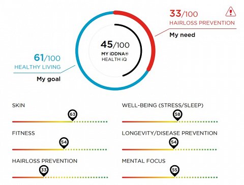
I was able to view my results in separate sections of my online account, but found that the My GPS PDF allowed me to see most of them all in one place. It was a 50-page document that started with a section entitled ‘All About You’. This provided me with my ‘iDDNA Health iQ’, which I was concerned to see was only 45 out of 100 (shown below).

My iDDNA Health iQ.
A short paragraph explained that my Health iQ represented my “Optimum-Personal Well-being” across “all aging underlying dimensions”. It went on to describe the way it was worked out, which seemed to be using lifestyle factors combined with my genetic results. I found the way that it was worded quite confusing, and although I understood the general idea, I wasn’t completely sure what my Health iQ was.
I was also unsure about where the ‘Healthy Living’ goal had come from, but could see that my ‘Hairloss Prevention’ need had been highlighted because it was the lowest of the individual scores. This page seemed to be a summary and I guessed that I’d find out more about each result later on in the report.
Results Section: My System Nutrition
I moved on to another summary page, this time specific to nutrition, which provided an overview of my physical measurements, my height, weight, BMI and percentage body fat (taken from the information I’d provided when registering my kit). ‘My Ideal Weight Range’ was also included, (I wasn’t sure what this had been based on) as well as ‘My BMR’. I didn’t know what BMR was, but when I looked it up on Google I found out that it was a way to show how fast or slow my metabolism was, specifically looking at the number of calories I would burn if I were to do nothing for 24 hours.
This section went on to look at different categories of results in more detail. Green and red colour coding and symbols showed whether each result was positive or negative and they were sorted into four categories: ‘My Weight Management’, ‘My Macronutrients’, ‘My Micronutrients’ and ‘My Preventative Nutrition’. My Macronutrients results summary is shown below.

My Macronutrients Summary.
At first, I was a bit alarmed by the ‘Gene Alert’, but after going through all four sections, I realised that one of these had been provided for each category, so assumed that it was just the highest risk identified within that area. I thought this was a clear and effective way to display summaries of my results.
Results Section: My Smart Meal Planner
The next section explained how to use ‘My Smart Meal Planner’, a feature I’d seen when I’d first logged into my account. I loved the name and the layout of the first page of this section, ‘My Happy Plate’ (shown below).

My Happy Plate.
I thought this was an excellent way to demonstrate how to use my hands to get the right portions, meaning I wouldn’t have to weigh everything to stop myself from eating too much, and was very happy to see pizza included on the plate!
It explained how to use the Smart Meal Planner, using an example of a day’s plan to demonstrate what was described. I was really pleased to find this explanation, as I’d felt a bit overwhelmed by the numerous options and symbols when first looking at this tool. I also liked that the default plan could be edited, swapping suggested foods using a list of similar alternatives. I also appreciated that the measures were given in ‘My Happy Plate’ units as well as in grams/ml, giving me the choice of how I portioned them. In addition, a helpful list of average ‘Household Measurements’ (e.g. slice of ham = 6-9g) was included, making this even easier. Having read through this introduction, I looked forward to using the planner to organise and improve my diet.
This explanation was followed by breakdowns of the various components I should be including in my diet. It started with a ‘My Healthy Micronutrient Needs’ summary (shown below), which was then split into five sections, ‘My Vitamins’, ‘My Minerals’, ‘My Antioxidants’, ‘My Amino Acids’, ‘My PUFA’. There was also a ‘Custom Supplement Plan’ which included names, quantities (in mg) and percentages of supplements I could take to improve my micronutrient levels.

My Micronutrient Balance.
A short paragraph explained that these percentages had been calculated using my preferences/goals, body measurements and genetic results.
Whilst I was familiar with most of the micronutrients, I wasn’t sure what PUFA was, and couldn’t find an explanation. I looked it up on Google and found out that it stood for polyunsaturated fatty acids, found in plant oils and fish.
For each of the sections, named examples were provided, which included numerous food suggestions. I appreciated that these had been included, rather than just listing lots of abstract and scientific sounding components, as it made increasing these nutrients into my diet seem much less intimidating.
Although this was primarily a diet report, there was a short section on fitness as well. The measurement used for the recommendation (MET) was well explained, and I learnt that it involved the level of oxygen required for an activity, so reflected the intensity of the exercise. MET hours (i.e. how many METs you can do in an hour) were used as a measurement of the intensity of different exercises. I was recommended to do eight METs worth of activity per week and, looking at a scale that showed example activities and their relative MET scores, it seemed that I’d be able to achieve this by, for example, doing an hour of ping pong. This didn’t seem like much exercise for a whole week, so I was worried I’d misunderstood the scale, but couldn’t work out an alternative way to interpret it.
Results Section: My iDDNA Index and My Genes
The iDDNA Index showed the current level I was ageing at vs. the level I could hope to achieve with the right lifestyle changes. It was displayed as a graph showing a spectrum of colours, with red for ‘Premature Ageing’, going through ‘Chrono Ageing’ and ‘Healthy Ageing’ to green for ‘Ideal Ageing’. I was happy to see that all of mine were in the Healthy or Ideal Ageing sections and was pleased to have a visual motivation to progress. There was a long description of exactly how the index worked and would develop, but I found this added confusion.
The final and, in my opinion, most impressive section of the report was the ‘My Genes’ section. It listed all of the individual results, including the name of the gene analysed, its associated trait, the SNP result and the outcome, given as a green, yellow or red face with a smile, straight face or sad face (examples shown below).

Some of the individual My Genes results.
These results took up 25 pages, so there was loads of data. At first, it looked a bit confusing, but there was a helpful guide to reading them, which explained that the SNP column contained my actual DNA sequence at the specific point they had examined (e.g. AG). I also learnt that the strange numbers and letters in the third column were codes for the gene analysed, as well as where in the gene they had looked specifically.
Although I didn’t fully understand this and a few other aspects of the table, I was really pleased that these detailed results had been included and particularly liked the use of the faces, which had made the outcome simple to understand.
Summary
The iDDNA test provided me with insights into my health and introduced me to some innovative approaches to dieting. I particularly liked the ‘My Happy Plate’ portion control method and appreciated the inclusion of the individual results, meaning I was able to further independently explore my DNA.
I felt that certain sections could have been explained a little more clearly, as I was often left to guess what parts of the results meant, though the associated tools and measurements explanations were useful and comprehensive.
I also found it strange that it was quite difficult to find out about and order the test, but was glad I’d persevered. I came away with not only knowledge about how to personalise and improve my diet, but with the tools to implement what I’d learnt.